
A Guide to Design Web UI for Better Engagement

Before you even think about picking a color palette or writing a single line of code, the real work of designing a killer web UI begins. It all starts with a rock-solid foundation. This isn't the flashy part, but it's where you translate what your users actually need into a logical, intuitive structure.
Think of it as building the skeleton before adding the skin.
Building Your Foundation for Engaging Web UI
A truly great user interface doesn't just happen. It's born from a deliberate process that puts the user at the center of every decision, right from the get-go. Rushing past this foundational stage is like trying to build a house without a blueprint—it might look okay for a minute, but you're guaranteed to run into serious problems down the line.
The whole point here is to set clear goals, get inside the heads of your users, and map out their journey from start to finish.
Nailing this upfront makes every subsequent design choice purposeful. It also makes the entire development process smoother, especially when you're working with an AI app generator like Dreamspace. Giving the AI a clear vision means it can turn that vision into a functional app far more effectively.
From Goals To Blueprints
The first phase is all about moving from abstract ideas to a concrete plan. You start by defining what success looks like, then dive deep into understanding your users, and finally, sketch out the basic structure. This approach keeps your design grounded in strategy, not just guesswork.
It’s a straightforward flow that looks something like this:

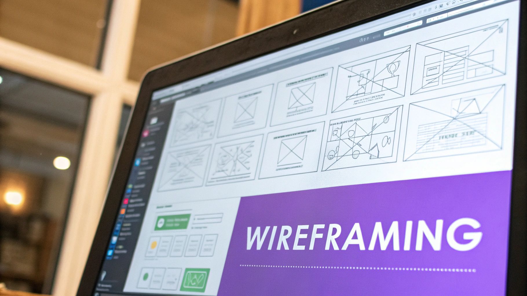
As you can see, wireframing is the end of the foundational process, not the beginning. It’s built on solid research and clear objectives. If you really want to get this right, it pays to brush up on the fundamentals, like these 9 best practices for user interface design.
An interface is like a joke. If you have to explain it, it’s not that good.
This old saying perfectly captures the goal of intuitive design. Your user should never have to stop and think about what to do next. It should just feel natural.
The business impact here is huge. With 81% of consumers doing online research before buying anything, your website is often the first handshake. The problem? Research shows a staggering 75% of users will judge your company’s credibility based purely on its website design. Your UI is directly tied to trust and, ultimately, revenue.
Here's a quick look at some of the core principles that guide this foundational stage.
Core Principles for Engaging UI Design
This table breaks down the key ideas you need to keep in mind to create an interface that's both beautiful and easy to use.
Think of these principles as your north star. By keeping them front and center during the foundational phase, you're setting yourself up to build an interface that people will actually enjoy using.
Crafting Your Visual Language
Once you've got the structural blueprint locked in, it's time to give your design some soul. This is where we move past the black-and-white wireframes and start making the choices that shape how a user actually feels when they interact with your app. You’re building a visual language that's not just nice to look at, but also works hard to guide the user.
This language really boils down to three things: color, typography, and layout. When you get these right, they work together to direct the user's eye, create a clear sense of priority, and make the whole experience feel intuitive. They're the foundation of a design that people trust.

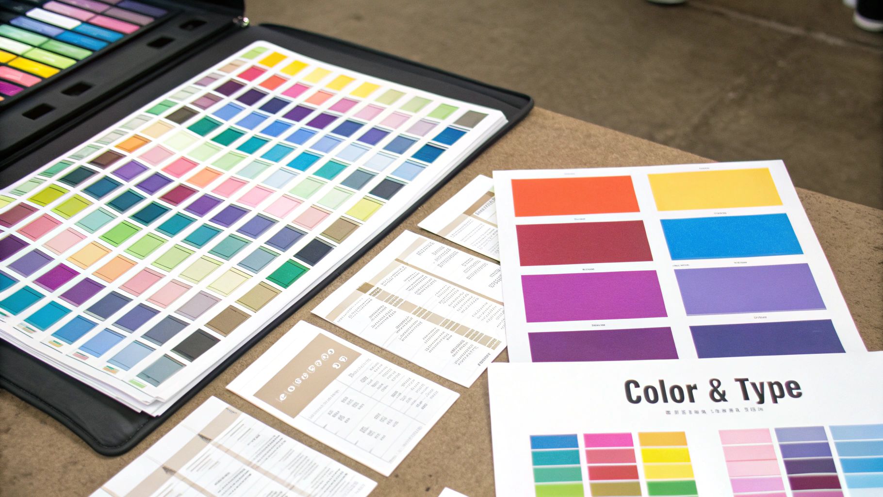
Nailing Your Color and Typography
Color isn't just decoration; it's a shortcut for communication. Your palette sets the entire mood of the app. It reinforces your brand and, most importantly, screams "click me!" for buttons and links. A fintech app might stick to a serious, trustworthy blue, while a meditation app would probably lean into softer, calming pastels.
But it’s not all about vibes. Accessibility is non-negotiable. Your colors need enough contrast so that text is easy to read against its background, especially for users with visual impairments. There are plenty of free tools out there that let you check your palette against the official Web Content Accessibility Guidelines (WCAG). Don't skip this.
Typography is the other half of this partnership. One of the most common mistakes I see is designers using way too many fonts. It just creates visual noise. A much better approach is to pick just two complementary fonts—one for your headings, one for your body text. This simple choice immediately creates hierarchy and makes your content far easier to scan.
When you design web UI elements, remember that good typography isn’t about making words look pretty. It's about making them readable and creating a clear path for the user’s eye to follow.
Think of it this way: your heading font is the big, bold signpost, and your body font provides the detailed directions. The contrast between them is what makes the journey feel effortless. This clarity is absolutely crucial when you’re building an interface that will eventually become a real product, like the apps generated with the Dreamspace vibe coding studio.
Bringing Order with Grids and Spacing
Your layout is the invisible skeleton holding everything together. A good grid system provides a consistent structure, making sure every element is aligned and organized from one page to the next. It’s what makes a design feel intentional and professional instead of accidental.
Just as important is what you don't put on the page. I'm talking about spacing, or whitespace. It’s the breathing room that keeps your interface from feeling cluttered and overwhelming. When you space things properly, you naturally group related items and separate unrelated ones, which helps users understand the content at a glance.
Here are a few layout fundamentals to live by:
- Stick to a Grid System: A 12-column grid is a classic for a reason. It gives you a reliable framework for aligning content and helps ensure your design looks clean and organized, even on different screen sizes.
- Embrace Whitespace: Don’t be afraid of empty space. Generous margins and padding around text blocks and UI components make your interface feel calmer and more focused.
- Keep Spacing Consistent: Pick a spacing scale and stick to it. Using multiples of 8px for margins and padding is a common and effective technique. This creates a subtle rhythm that makes the whole layout feel harmonious.
By really focusing on color, typography, and layout, you’ll turn a basic wireframe into a polished, user-friendly interface. These are the tools you use to build a visual language that speaks clearly to your users, guiding them through a great experience.
Picking Your UI Design Toolkit
Your design tools can either be your best friend or your biggest headache. The right software helps you move faster, work better with others, and ultimately produce higher-quality designs. But let's be honest, with so many options out there, choosing the right tool to design web UI elements can feel like a chore.
The good news? Most modern design tools share the same core features. The real decision boils down to your specific workflow, the size of your team, and what you’re trying to build.
For instance, Figma has pretty much become the industry standard, and for good reason—its real-time collaboration is second to none, making it a no-brainer for teams. On the other hand, Sketch is still a powerhouse for solo designers who live and breathe macOS and prefer a native app experience.
Then you have Adobe XD, which fits perfectly into the Adobe Creative Cloud. If you’re already deep in the Adobe world with Photoshop and Illustrator, XD feels like a natural extension. It’s not about finding the "best" tool, but the best tool for you. And the demand for this work is exploding—the US web design services market is projected to hit $47.4 billion in 2025. It's a huge field, and having an efficient workflow is your key to standing out.
A Quick Tool Comparison
To help you decide, let's look at what really sets these tools apart. This isn’t every single feature, but it covers the main things I consider when starting a new web UI project.
No matter which one you land on, the goal is to master it. But the software itself is only one piece of the puzzle.
Go Beyond the Canvas with Design Systems
The real secret to designing at scale? Design systems and component libraries. Think of a design system as a living collection of reusable components, all governed by a clear set of standards.
A design system isn't a project. It's a product, serving products.
This changes everything. Instead of creating a new button from scratch every single time, you just grab the "primary button" component from your library. This not only saves a massive amount of time but also ensures your entire application looks and feels consistent. If you're curious about how these ideas translate into automated workflows, you might find some useful insights in our guide on how to build a website with AI.
This becomes incredibly powerful when working with a platform like the Dreamspace vibe coding studio. When you hand over a design that’s built on well-defined components, the AI app generator can read your vision with far greater accuracy. It drastically shortens the distance from a static design file to a fully functional, live app, turning your component library into the direct blueprint for the final product.
Designing for Interaction and Responsiveness
A static interface is a missed opportunity. To build a web UI that actually pulls users in, your design needs to feel alive—it should react to touch, offer feedback, and flex gracefully to fit any screen. This is where interaction design elevates a decent layout into a genuinely great experience.
The magic is usually in the small stuff. Microinteractions are those tiny, purposeful animations that confirm a user's action. Think of the subtle bounce when you pull to refresh a feed, or a button that glows when you hover over it. These moments provide instant feedback, making the whole interface feel more intuitive and alive. They create a silent conversation with the user, letting them know the system heard them loud and clear.
Adopting a Mobile-First Mindset
Beyond just slick animations, your design has to be flexible. This is where responsive web design comes in, ensuring your UI looks and works great everywhere. A clunky mobile site is one of the fastest ways to lose someone, which is why a mobile-first approach is non-negotiable for me.
This strategy forces you to get ruthless with your priorities. By designing for the smallest screen first, you have no choice but to focus on the absolute essentials. It makes you answer the hard questions right away: What's the one thing a user must do here? What content is absolutely critical?
Starting with mobile constraints forces clarity. You can then progressively enhance the design for larger screens, adding secondary features and more complex layouts where space allows. This ensures a lean, focused experience on every device.
Trust me, this discipline pays off. Not only does it produce a killer mobile experience, but it also leads to a more organized and intentional design across all breakpoints—from a tiny phone to a huge desktop monitor.
Why Responsiveness Drives Growth
People jump between their phones, tablets, and laptops all day long. A UI that can't keep up isn't just an inconvenience; it's a liability. This relentless focus on the user is what's behind the massive growth in this space. The global UI design market was valued at around $2.43 billion in 2024 and is on track to hit $7.43 billion by 2032, all because users demand seamless experiences.
Building these kinds of adaptive interfaces can be tough, but the tools are getting better. For developers building on a platform like Dreamspace, a well-thought-out responsive design acts as a clear blueprint. When the AI understands how elements should reflow and adapt, it generates much cleaner code. You can see how this works by checking out an AI-powered coding assistant.
By designing for interaction from the get-go, you ensure the final product isn't just functional, but genuinely enjoyable to use, no matter where someone is using it.
Bridging the Gap Between Design and Development
A beautiful design is just a static image until someone actually builds it. The handoff to development is where your vision gets real, and frankly, it's where things often fall apart. A messy handoff means endless emails, wasted hours, and a final product that’s a pale imitation of your original design.
To get ahead of this, you have to see the handoff not as a final step, but as a core part of the design process. It’s all about meticulous documentation—leaving absolutely no room for a developer to guess what you were thinking. When they have a crystal-clear blueprint, they can build quickly and accurately.
This is even more critical when you're working with tools that automate parts of the build. For an AI tool like the Dreamspace vibe coding studio, a perfectly prepped design file isn't just a guide; it’s a direct set of instructions. The better the input, the more faithfully the generated app will match your creative vision.
Creating a Bulletproof Handoff Checklist
Think of your handoff as the ultimate instruction manual for your UI. It needs to answer every question a developer might have before they even have to ask. The goal here is to kill ambiguity.
Your documentation needs to be exhaustive. I’m talking pixel-perfect spacing for every margin and pad, the exact hex code for every single color, and a full breakdown of font families, weights, and sizes for every text style. Don't leave out asset specifications or interaction states, either.
Here’s a practical checklist to make sure nothing slips through the cracks:
- Typography Specs: Define all your styles—H1, H2, body copy, etc. Include the font, size, weight, and line height for each.
- Color Palette: List all primary, secondary, and accent colors with their hex or RGB values. Don't forget to define colors for states like success or error messages.
- Spacing and Grid System: Document your grid layout (e.g., a 12-column grid) and the core spacing values you're using. An 8px grid system is a common and highly effective standard.
- Component States: Visually show how interactive elements like buttons, inputs, and links look in all their different states: default, hover, focused, active, and disabled.
- Assets: Export all icons, logos, and images in the right formats (SVG for icons is a must) and resolutions. Make sure they're organized and easy for the dev team to find and use.
Modern Tools That Automate the Process
The good news? You don't have to manually create a 50-page PDF spec document anymore. Modern design tools like Figma have completely changed the game with built-in features that streamline this whole process. Developers can simply click on any element in your design file and instantly see the CSS attributes they need.
The best design handoffs feel less like a one-time event and more like an ongoing collaboration. Modern tools facilitate this by creating a single source of truth that both designers and developers can reference.
This kind of transparent workflow is a massive time-saver. These tools can automatically generate style guides and export assets, which cuts down on human error and keeps the entire team perfectly aligned. For teams looking to build faster, understanding this is key. If you're curious about how this level of automation is changing the game, you can learn more about the world of no-code development and what it enables. At the end of the day, a clean, well-documented design is the perfect launchpad for any development process, whether it’s automated or traditional.
Got Questions? Let's Talk Web UI Design
As you dive deeper into web UI design, you're bound to run into some recurring questions. The field moves fast, and it’s easy to get tangled up in jargon or shifting best practices.
Let's clear the air. I've rounded up some of the most common questions I hear from designers and broken them down into straightforward, no-fluff answers. Think of this as your go-to cheat sheet.
UI vs. UX: What's the Real Difference?
This is the big one. It comes up all the time, and for good reason—the two are deeply connected but fundamentally different.
The simplest way I can put it is this: User Experience (UX) is the overall feeling a person gets from using your product. Did it make sense? Was it frustrating? Did it solve their problem efficiently? UX is the invisible architecture—the logic, the flow, the problem-solving.
User Interface (UI), on the other hand, is what you actually see and touch. It's the buttons, the color palette, the typography, the spacing. It’s the tangible, visual layer that brings the UX strategy to life.
I always think of it like building a house. UX is the blueprint—where the rooms go, how you move from one space to another, ensuring it's a functional, comfortable place to live. UI is the interior design—the paint on the walls, the style of the furniture, the light fixtures. You absolutely need both to create a home people love.
How Can I Make My Web UI More Accessible?
Accessibility isn't a "nice-to-have" checkbox you tick at the end of a project. It’s a core responsibility of any designer. When you ignore accessibility, you're actively choosing to exclude people from using what you've built.
Making your design web ui accessible doesn't have to be complicated. Start with these fundamentals:
- Mind Your Color Contrast: Text needs to be clearly readable against its background. This is a non-negotiable for users with low vision. Use an online contrast checker to test your color pairings against WCAG standards.
- Embrace Keyboard Navigation: Can someone use every single interactive element—buttons, links, forms—with just their keyboard? They should be able to. This is critical for users who can't use a mouse.
- Write Solid Alt Text for Images: If an image conveys information, you need to describe it in the alt text. This allows screen readers to explain the visual content to users who are blind or have low vision.
What Key Web UI Design Trends Should I Watch?
Keeping an eye on trends helps your work stay relevant, but don't just follow them blindly. The best trends are rooted in creating better, more human-centric experiences.
Right now, dark mode is still a huge favorite. It's easier on the eyes in low-light settings and just looks incredibly sleek. Microinteractions—those tiny, delightful animations when you click a button or refresh a page—are also getting much more sophisticated, making interfaces feel alive and responsive. And of course, minimalism isn't going anywhere. Clean layouts and generous white space help create focus and reduce cognitive load.
Looking ahead, we're seeing more AI-driven personalization and a growing focus on voice user interfaces (VUI). Getting a feel for these trends can give your work an edge, especially when you're bringing your vision to life with an AI app generator like the Dreamspace vibe coding studio.
Ready to turn your design vision into a fully functional on-chain application? With Dreamspace, you can generate smart contracts, query blockchain data, and launch your website with AI. No code needed. Start building today.